
Piggy bank
UX / UI design
Google UX Certification Project
Project overview
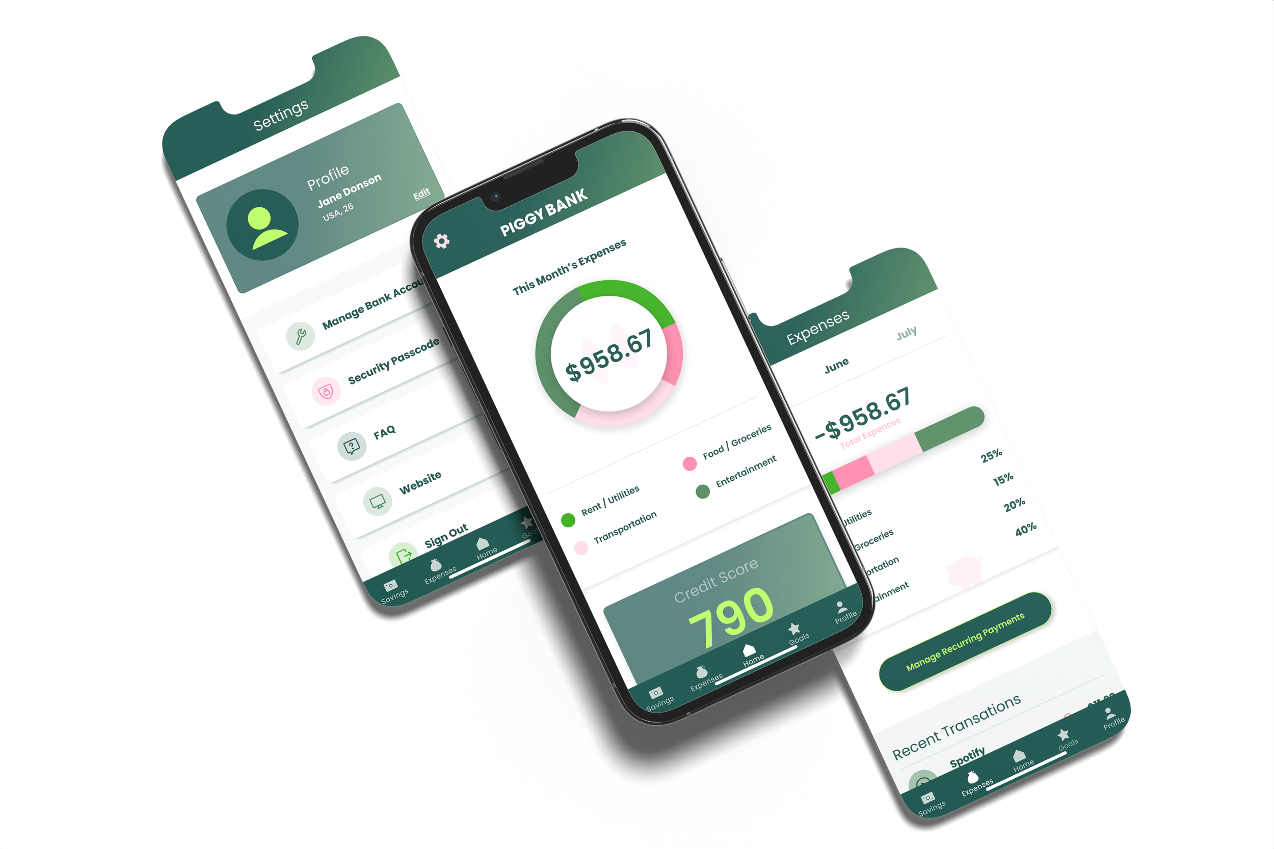
PiggyBank was completed as my Google UX Design certification capstone — and became the project that most clearly showed me where behavior design and UX intersect.
PiggyBank is a financial literacy app designed to help adults build saving habits through goal-setting, progress tracking, and light gamification. This project was completed as part of the Google UX Design certification and represents my full end-to-end UX process — from user research and persona development through wireframing, prototyping, and usability testing.
Tools


Google certification course
UX Design
Role
UX Designer
Duration
8 Weeks
The problem
Most financial apps overwhelm users with complexity before they've built any confidence with their money.
The opportunity wasn't to build a more powerful tool — it was to design a simpler, more human one. Research surfaced a consistent pattern: adults who struggled with saving weren't lacking willpower, they were lacking a clear starting point. The design challenge became: how do you make the first step feel achievable?
My role
Lead UX designer
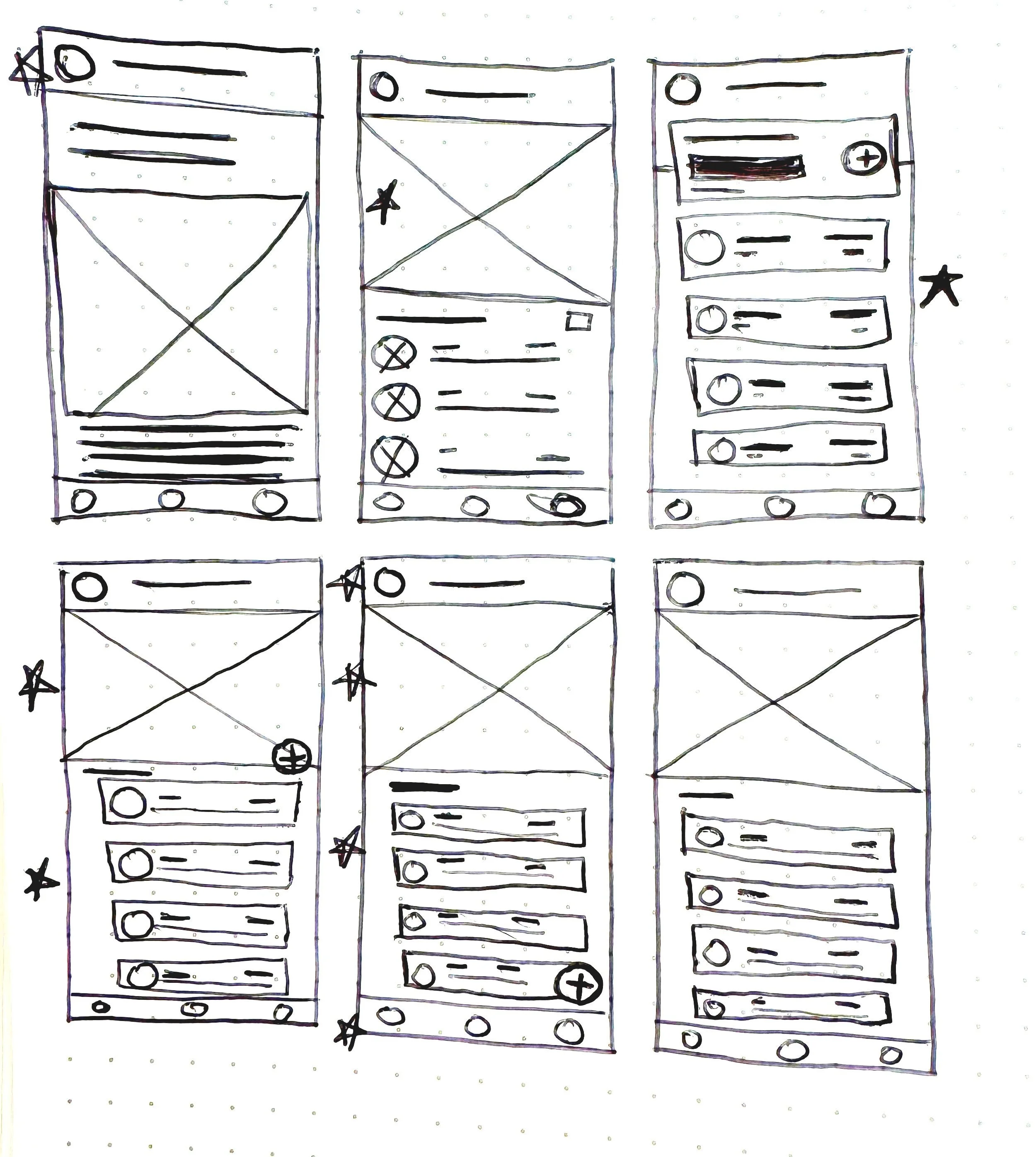
As the Lead UX/UI Designer, I led the design process from research to final prototype, focusing on creating an intuitive and user-friendly interface. I conducted user research, developed personas, created wireframes, and high-fidelity prototypes, and conducted user testing.

Process
The UX/UI design process for the savings app involved user-centered research, iterative design, and user testing to create a functional and user-friendly product.
I started by interviewing adults who described themselves as "bad at saving" — and the pattern wasn't about willpower, it was about visibility. When progress felt invisible, saving felt pointless. That insight drove every major decision: the dashboard went through three rounds of iteration after early usability testing revealed I'd recreated exactly the overwhelm users described by showing too much at once. I stripped it back to one primary number — progress toward the active goal — and moved everything else behind a tap.
The gamification layer wasn't decorative. Users who saw visual savings progress in early prototypes used the word "in control" unprompted across multiple sessions. Badges and progress rings were a direct response to that data, not an aesthetic choice.
The solution
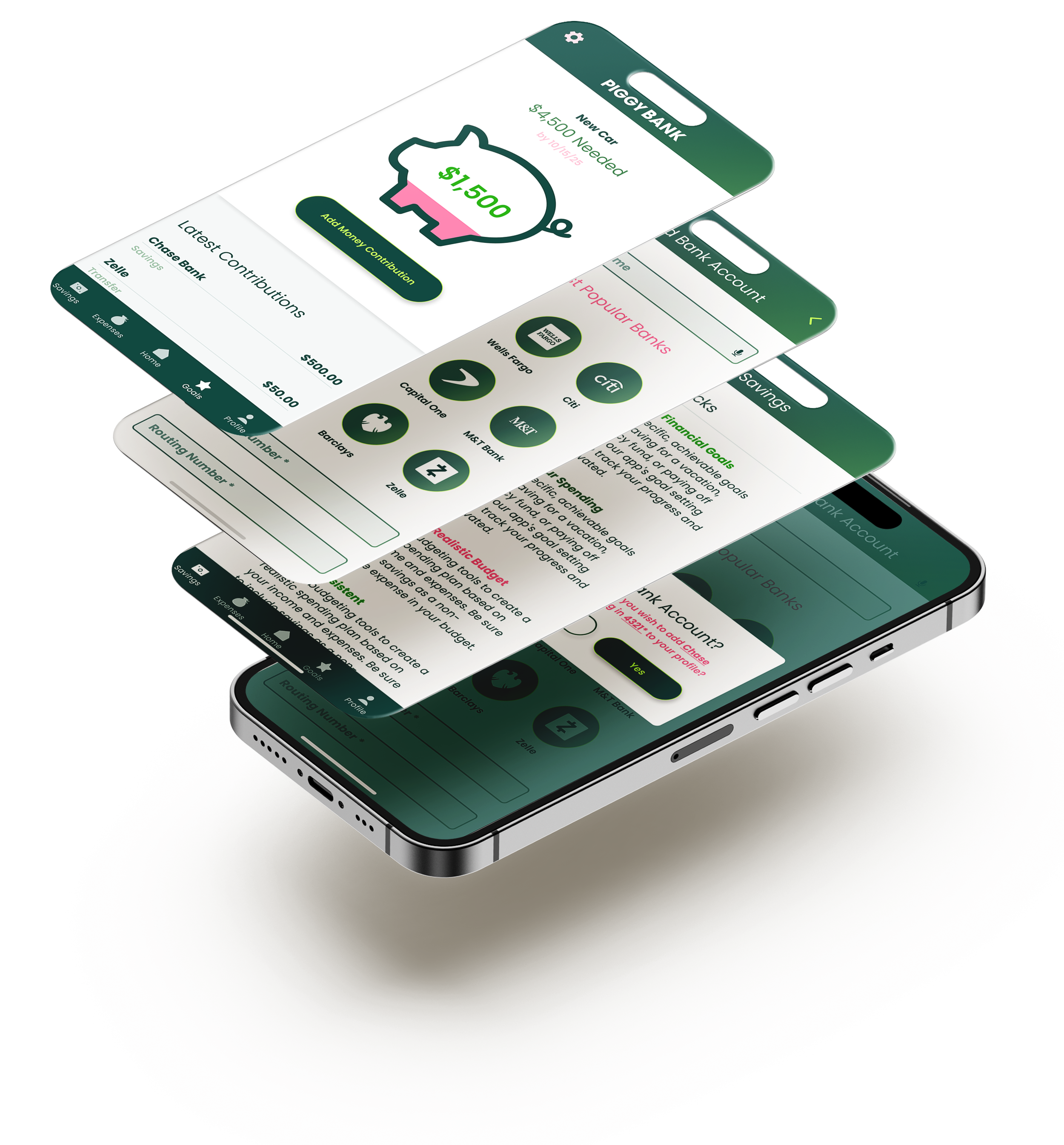
An app that offers a personalized, goal-based savings structure with a visually appealing interface, gamification elements, and an intuitive design.
PiggyBank provides users with a personalized, goal-based savings experience. The app features a clear, visually appealing dashboard that tracks savings progress, sets custom goals, and provides motivational prompts. Gamification elements, such as earning badges for achieving milestones, help keep users engaged and motivated. The clean, minimalist UI ensures an intuitive experience, making the app accessible even to users with limited financial knowledge.
What I learned
This project sharpened my understanding of where UX and behavior design intersect.
Designing for motivation is different from designing for usability — a user can understand exactly how to use a feature and still not use it. The gamification elements (milestone badges, visual progress indicators) weren't decorative decisions; they were responses to a specific research insight about how users emotionally disengage when progress feels invisible. Testing validated this: users who saw visual savings progress in early prototypes reported feeling more "in control" — a word that came up unprompted across multiple sessions.
Want to read more?
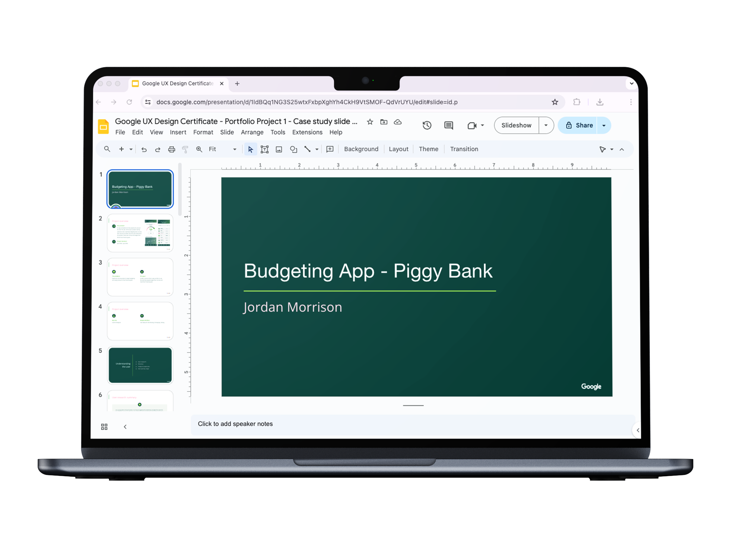
View the slide deck created during the Google course with a more in-depth step by step process illustrated.