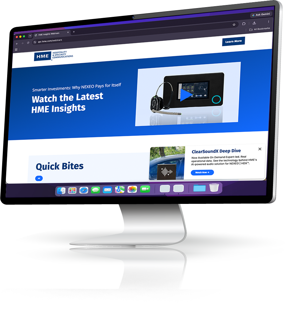
HME insights & ClearSoundX
Brand systems, digital design, and experiential
Project overview
HME Insights launched as a B2B webinar program for HME — a drive-thru technology company — to build brand awareness and educate the industry. I inherited the program and rebranded it from the ground up in 2025, establishing a visual system that could scale across email, web, social, and video without requiring a redesign for every new episode.
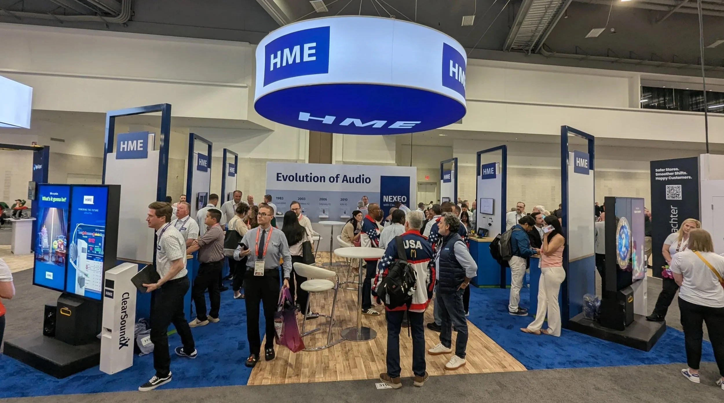
When ClearSoundX — HME's newest product — was slated for a major launch at the McDonald's Worldwide Convention on June 1, 2026, the brand system faced its biggest test. I extended it into a full product launch identity: a new ClearSoundX logo, digital assets, convention booth experience, merchandise, a kiosk demo, and a post-launch email, webinar, and social campaign. The result exceeded HME's sales goal, reaching $5.5M.
Tools


Team
Marketing coordinator
Paige Hammerschmidt
Senior marketing copywriter
Eliza Ortega
Role
Senior graphic designer
Duration
March 2026 - June 2026
The problem
An established webinar program with no visual foundation — and a major product launch on the horizon.
When I took over HME Insights, the program had momentum but lacked a cohesive visual identity. Assets were inconsistent across channels, there was no template system, and nothing was built to scale. Every episode required starting nearly from scratch.
In 2025, I rebranded the program entirely — establishing the visual language, module system, and channel-specific templates that the program runs on today. The ClearSoundX launch then raised the stakes further: HME needed a distinct product identity for their newest drive-thru audio solution, a physical presence at the McDonald's Worldwide Convention, and a full digital campaign ready to activate the moment the product went live. All of it needed to feel unified.

My role
I led the full creative output across the program rebrand, the ClearSoundX product identity, and the convention launch — from logo design to booth experience.
On the program side, I rebuilt HME Insights branding from the ground up: email module kits, the webinar webpage, a thumbnail and deck imagery system, Adobe Express templates for full-length episodes and Quick Bites, LinkedIn newsletter visual alignment, and on-demand recording edits.
For ClearSoundX, I designed the product logo, created all digital launch assets, and then extended the identity into the physical convention experience — merchandise, booth graphics, and an interactive kiosk demo that served as the centerpiece of HME's presence at the McDonald's Worldwide Convention. After the June 1 launch, I assisted in activating the digital campaign: email, webinar, and social assets built on the same system.

The rebrand of HME Insights came first, establishing the visual system everything else would be built on. Once that foundation was solid, I turned to ClearSoundX — starting with the product logo and working outward into the digital asset library.
Assets for the McDonald's Worldwide Convention began in March 2026, with the June 1 go-live as the non-negotiable deadline. I staged the build around convention production lead times: booth graphics and merchandise first, then the kiosk demo experience, then the digital campaign assets that would activate on launch day. The post-launch email, webinar, and social content launched simultaneously with the convention debut, so there was no gap between the physical and digital presence.
Rebrand the program. Build the launch identity. Deliver the physical experience.
Process
The solution
A product identity and launch experience that exceeded a $4M sales goal — and a program system built to scale every campaign that follows.
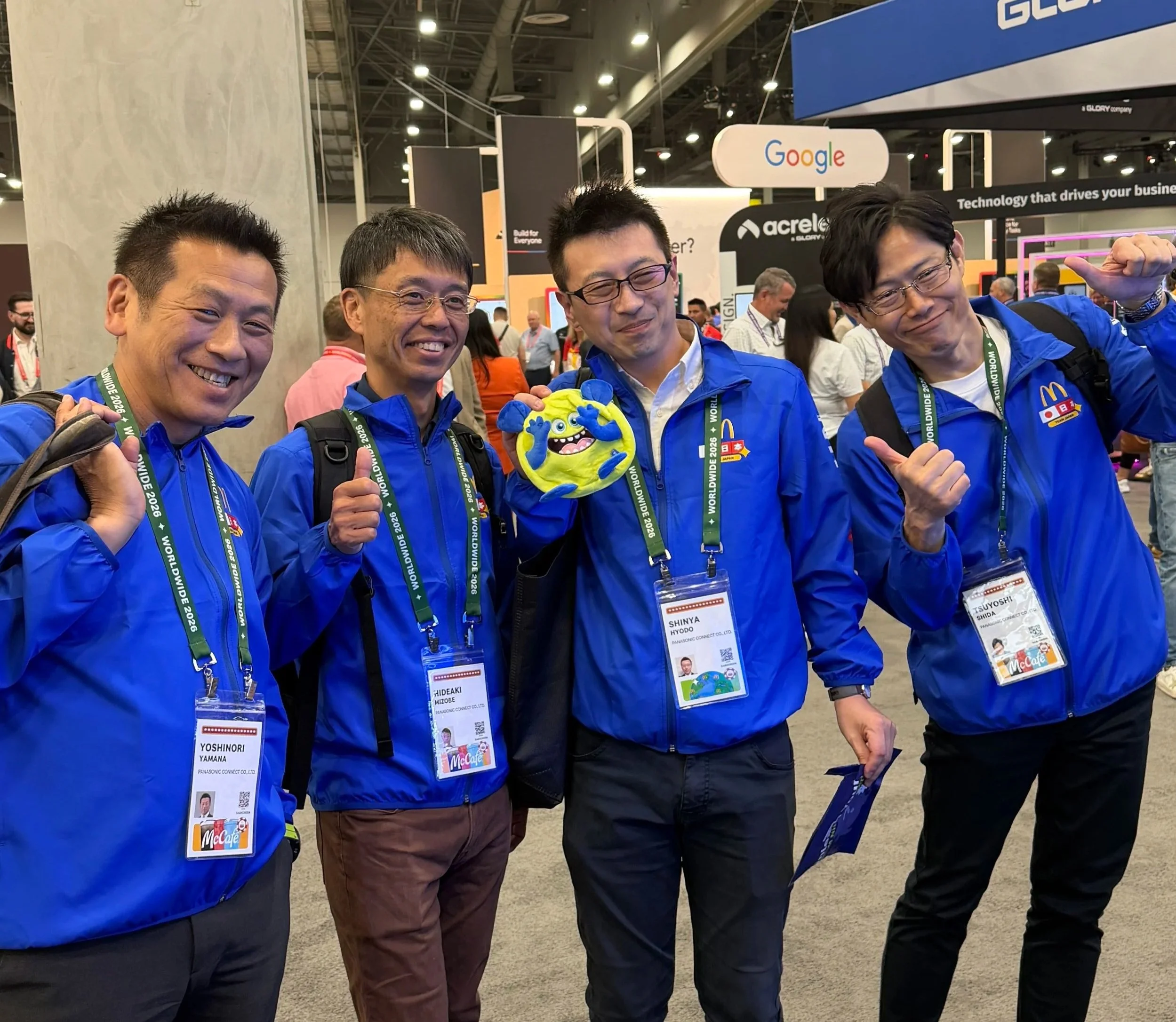
On June 1, 2026, ClearSoundX launched at the McDonald's Worldwide Convention with a full brand presence: a logo-led identity, booth graphics, interactive kiosk demo, and branded merchandise. The HMELabs and marketing teams helped the sales team exceeded their $4M sales goal, reaching $5.5M, making it the company’s most successful tradeshow to date.
The simultaneous digital campaign — email, webinar, and social — kept the momentum going after the convention floor closed. The launch-month email hit 2.7× the program's average open rate, 56% of the year's landing page traffic arrived that month, and 8 gated form submissions came in, half from net-new contacts. Two SEO posts launched as phase one of a longer content waterfall, with more to follow.
Rebuilding HME Insights branding from the ground up taught me that a program's design system is only as good as how little the team has to think about it. When the templates, tools, and visual rules are solid, the people using them can focus on the content — not the craft.
That's what I aimed for, and the ClearSoundX launch validated it:
The team executed a simultaneous physical and digital launch across multiple channels without the system buckling.
The convention experience also reinforced how much physical touchpoints shape brand perception. The kiosk demo and merchandise weren't decorative — they were proof-of-product moments that gave buyers something to feel and hold. Designing for that environment, with real production constraints and a real deadline, pushed me to be more decisive and to trust the system I'd built.
The best design systems are invisible — they give people confidence to act without thinking about the design at all.
What I learned
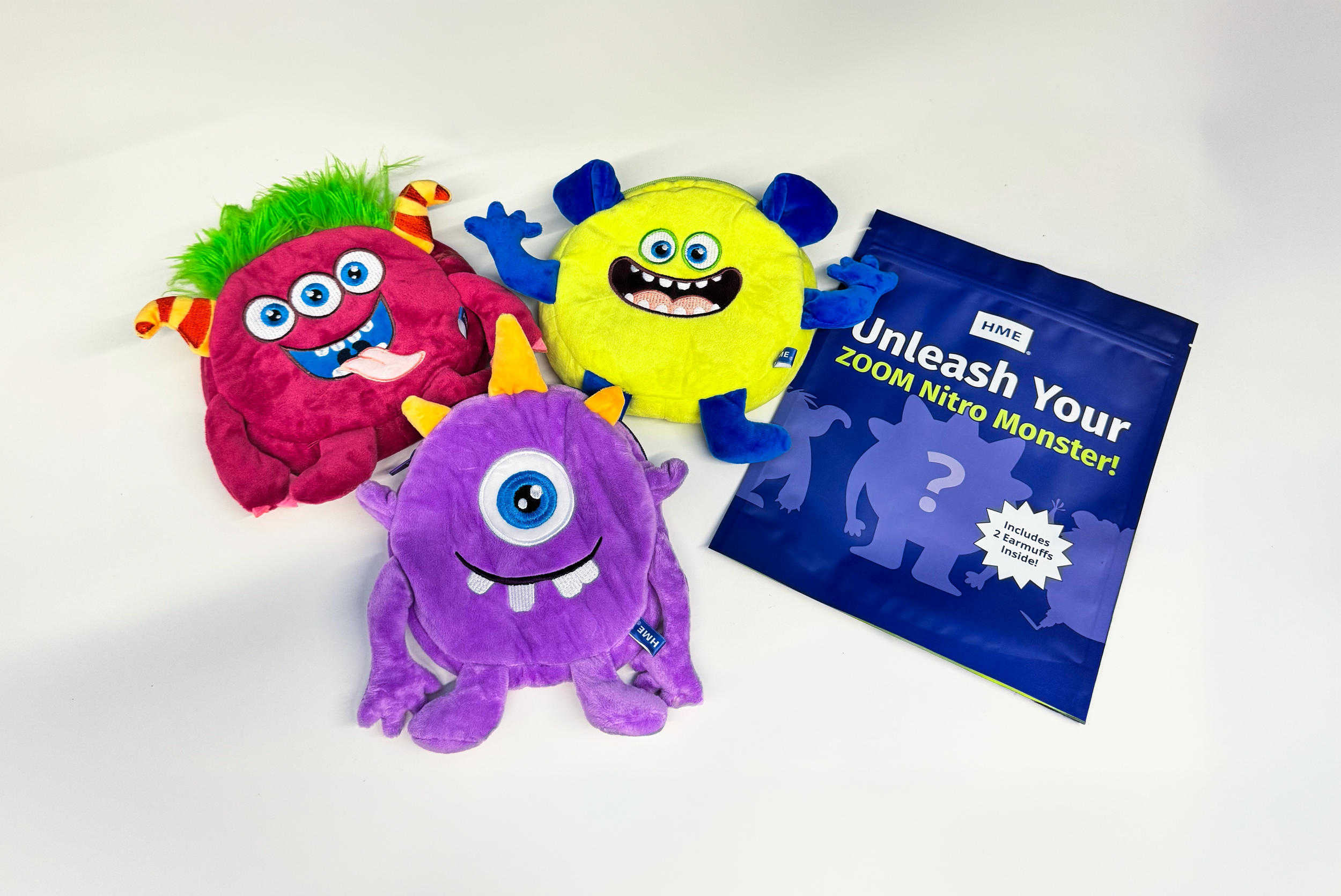
One of the most talked-about pieces at the HME booth wasn't a product demo or a banner — it was a blind bag keychain. I designed them as a functional piece of swag: each bag held a set of replacement earmuffs for HME headsets, along with information on purchasing accessories from the store and enrolling in an Equipment Maintenance Agreement. The packaging itself teased the reveal with a "Who's hiding inside?" prompt.
The characters inside were three custom avatars representing store types for HME's ZOOM Nitro Timer Gamification — giving attendees a tangible, collectible connection to a product they'd just seen demoed. The only way to get one was to win it through an interactive slot machine at the conclusion of the theatre demo, which drove foot traffic to the booth and gave the team a natural close to every presentation.
The response exceeded anything we anticipated. Attendees were wearing the keychains on their bags as they walked the convention floor — becoming walking brand impressions across the show — and people who hadn't visited the booth were approaching HME staff asking where they could buy them.
Designed to be useful. Built to be wanted. Won through play.
The swag that stopped the show